
Nothing captures the identity and tribalism of the beautiful game quite as succinctly as a club crest. It is a powerful icon, capable of stimulating deep neural connections for supporters; an image that evokes memories of triumph, grief and every conceivable emotion in between.
For many fans, the very notion of changing a club crest is anathema. Recent initiatives by both Inter Milan and Juventus to update their crests have provoked outrage amongst segments of the fan base. Traditionalists dismiss this rebranding as unnecessary tinkering at best, and an exercise in egregious corporate greed at worst.
However, the reality is that club crests evolve with a degree of regularity, and always have done. Inter’s latest change represents the club’s sixteenth iteration and comes only a decade after the previous major overhaul.
During the early years of Italian football, few clubs used crests at all. Where they did, it was often an adaptation of the civic emblem or a simple representation of the club colours on a shield. Fewer still displayed crests on their shirts; of those, Milan, Pro Vercelli and Novara all used imagery taken from the city’s coat of arms. There was an emerging faunal theme too; Inter unofficially adopted the snake from the Sforza family coat of arms, whilst the City of Turin’s bull was given a prominent position on Juventus’ crest.
In 1928, journalist Carlo ‘Carlin’ Bergoglio identified the potential for this kind of symbolism to raise the profile of football clubs and to forge deeper connections with the city and supporters. Inspired by those early examples from Inter and Juventus, his proposal, outlined on the pages of the Guerin Sportivo newspaper, was for each club to adopt a character or an animal that would personify the club.
“Everyone will understand how an easy feature benefits the sympathetic popularity of a football unit, which strikes the imagination of the young public, making them smile and lend themselves to the exaltation of humour. Perhaps many teams do not have the celebrity they deserve precisely for this greyness, for this lack of popular denomination.”
Carlo Bergoglio
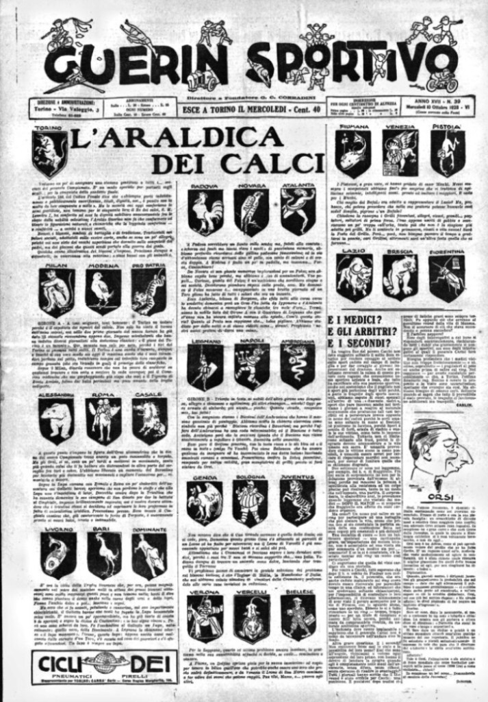
A series of referenda were coordinated by local newspapers to select a mascot to represent their local football teams. The culmination of these endeavours – titled L’Araldica dei Calci (Heraldry of Football) – was first published on the front page of the Guerin Sportivo on 10 October 1928.
This nationwide exercise marked the conception of some of the most famous symbols in modern Italian football. Many of the choices were uncontentious in building on the theme of existing civic imagery. Torino adopted the rampaging bull, Genoa the griffin and Pro Vercelli appropriated the lion, all features of their respective city coat of arms.
Roman mythology gave us La Lupa Capitolina and the figures of Romulus and Remus for AS Roma, whilst Venezia adopted the winged Lion of San Marco. Naturally, Atalanta adopted the mythical goddess after whom the club is named.
Bologna adopted Balanzone, a plump scholarly figure that represented the city’s status as a seat of learning. The character took inspiration from a comedic figure commonly portrayed in the historic commedia dell’arte theatrical movement.

Other clubs looked back into their own history to find a mascot; AC Milan drew upon a famous quote of their founding father, Herbert Kilpin, in choosing a devil to represent their club.
In some cases, the connection was made between a club and its mascot for little more than chromatic reasons. A zebra was chosen for Juventus, whilst in Alessandria, a grizzly bear was chosen to mirror the club’s grey shirts. In the latter case, they subsequently doubled down by giving the bear a Borsalino, a style of hat famously produced in the town.
Padova adopted the motif of a hen, a majestic depiction of a local breed that carries a distinctive tuft of feathers on top of its head. This was in contrast to the less aesthetically-pleasing, but more purposeful cockerel – plucked and given spurs – that was chosen by the people of Bari. The latter remains a core part of the club’s identity today.
Several proposals failed to capture the imagination of the public. Rather inexplicably, a buffalo was selected for Lazio, overlooking the more obvious choice of an eagle that had been part of the club’s crest during their foundation in 1900. Napoli’s cheerful street urchin (scugnizzo) foundered and quickly faded, as did the unattractive cricket adopted by Fiorentina.

The local referenda did not get it all right, but Carlin’s visionary ideas about the potential for symbolism in Italian football certainly stuck. Numerous clubs that were not part of his initial exercise subsequently chose their own symbols – Sampdoria’s famous sailor Baccia, Palermo’s eagle, Foggia’s impish mascot, the list goes on.
Whether it is through club crests or the cartoons of the Italian sports dailies, the legacy of Carlin lives on in calcio.

With thanks to Ugo and Daniele Maccari the chief cartoonists for the Gazzetta dello Sport for permission to use the title image – check them out on Instagram @i_tifosissimi_official

Just want to say what a fascinating and well-crafted article this was. Learnt loads. Thank you.
LikeLike